Projects
Here you can find a non-exhaustive list of projects that I pursue on my own. Feel free to reach out if you’re interested in any of them.
California Agricultural Data Visualization
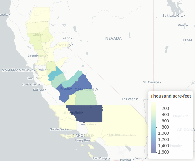
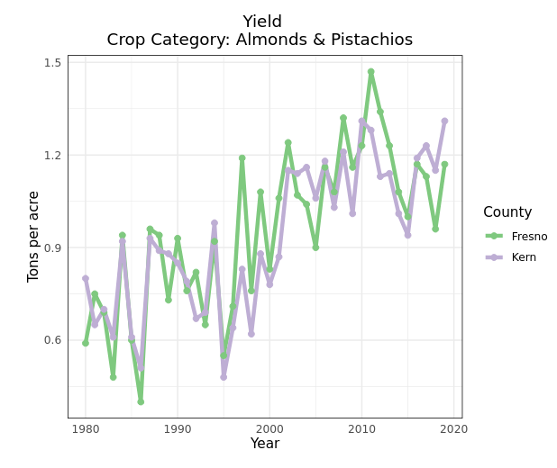
I created with the collaboration of undergraduate studens of our lab a visualization of the Department Water Resources data on crop water use and land use estimates, as well as visualization for USDA NASS data on crop prices, yield, total production and grosss revenue. All the data is visualized at a County scale available in the water systems management lab’s website in the agricultural data section
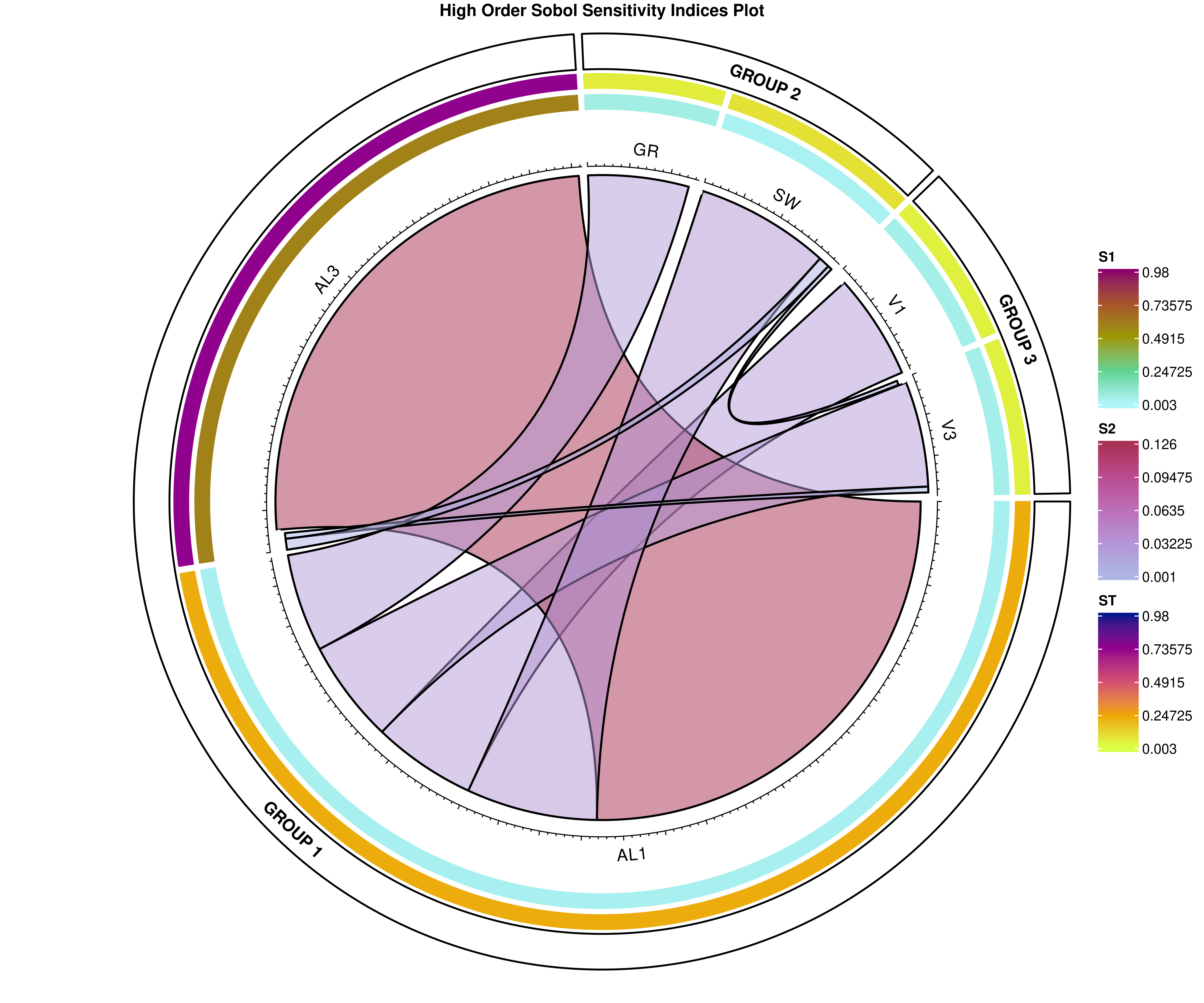
Global Sensitivity Analysis Indexes Visualization
This repo shows how to plot Sobol first, second and total order sensitivty indexes. I used R for the visualization and using the outputs obtained from SALib python library. Check out my github repo, you can follow the Rmarkdown example and create similar visualizations for your results.

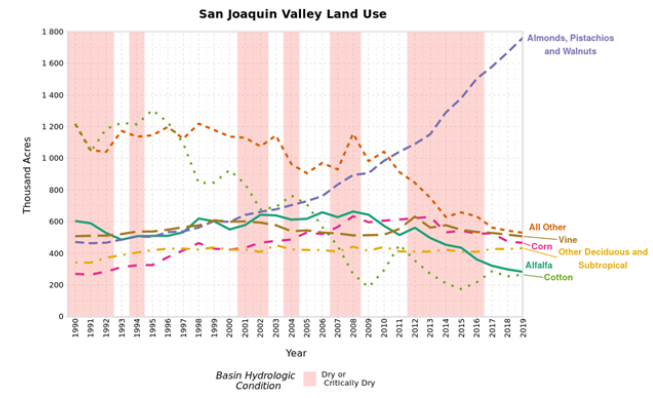
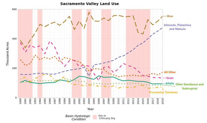
Central valley crop trends summaries Sacramento Valley and San Joaquin Valley
This repo contains the code to visualize cropland trends in the Central Valley California by the two main regions, used in the blog: Lessons from Three Decades of Evolution of Cropland use in the Central Valley